Showing posts with label Catherine Pooler. Show all posts

Saturday, January 24, 2026

Catherine Pooler | Celebrating Chinese New Year


I'm back with more inspiration for the Lunar New Year Challenge and, as I mentioned in my last post for the Challenge, I wanted to give a shoutout to all of our sponsors so today's focus is on Catherine Pooler Designs, who was our quarterly sponsor in both 2024 and 2025!


I made two very different cards using the same colour palette which was inspired by the artist Marina Zlochin. One card uses only Catherine Pooler inks and the other uses coloured cardstock I selected from my stash that perfectly matches those ink colours from the first card. All stamps and dies featured in these two cards are available from Catherine Pooler Designs.

(Click on any photo to enlarge)

My first card features products from five different stamp and die sets, including a sentiment and lanterns from Lantern Festival (still my favourite Chinese New Year set of all-time), dumplings and chopsticks from Hey There Dumpling (running a close second because it's so adorable), flowers from Happy Horseshoes, orange slices from Greenery of the Season and a frame using the two largest dies from Dots & Scallops Dies.


I started by stamping all of the elements using Do-Si-Do, Samba, Rouge, Tutti Frutti, Clay Mask and Cashmere, which is now my new favourite Catherine Pooler ink colour! It's literally the most beautiful pale, neutral colour and plays nicely with everything else.


I cut a second frame from white cardstock and glued the matte gold foil layer on top. After positioning all the pieces, I set everything aside and gold heat embossed the sentiment directly on to the card base. Then I used a combination of liquid glue, glue dots and thin foam squares to secure the scene.


My second card is a clean and simple design using the Circle Landscape Die, one of my favourite stand-alone dies. You can see more inspiration using this die HERE. Other products featured on my card include the sentiment from the Round of New Year Dies and stars from Happy Horsehoses.


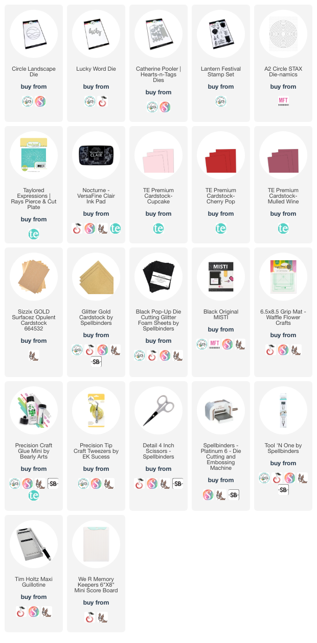
Since there's no stamping at all on this card, I went through my stash to find cardstock that perfectly matched the ink colours from the first card and these are Concord & 9th Sweet Pea, Hero Arts Coral, Spellbinders Pomegranate, Taylored Expressions Pumpkin, Spellbinders Coral, Spellbinders Chiffon and Concord & 9th Black.


The base panel was cut from Pomegranate cardstock and I cut the five pieces of the Circle Landscape Die from Chiffon, Sweet Pea, Hero Arts Coral, Pumpkin and Spellbinders Coral (top to bottom, respectively). The sentiment and stars were cut from Gold Glitter and I added a black shadow layer behind all the pieces which were then popped on the base panel with thin black foam squares.


Visit the January Link-Up Party post HERE to see all of the design team projects and be inspired to create your own! You can find the Challenge Rules HERE. Please tag us @lunarnewyearchallenge on Instagram and use the hashtag #lunarnewyearchallenge so everyone can find and be inspired by all your amazing projects.

If you’re inspired, some affiliate links are included below at no extra cost to you. Thanks so much for stopping by and I’ll see you again soon!

Supplies:

Saturday, February 8, 2025

Catherine Pooler | Lasso Life Collection + Limited Time Freebie


Hello, crafty friends! It’s been a minute but today I’m sharing three cards using products from Catherine Pooler‘s Lasso Life Collection. I’m a city girl at heart but I was excited to play with these beautiful horseshoes and fun sentiments.


The colour palette I chose for all three of my cards was inspired by the Calico Charm 6×6 Patterned Paper Pack. I only used five of the colours from this pack and they are Polished, Goldenrod, Succulent (*NEW), Glacier (*NEW) and Pebble.


This first card features the Happy Horseshoes Stamp Set and coordinating dies, plus the Lasso Life Sentiments Stamp Set. I love the three sizes of horseshoes together and it’s so much fun adding the die cut florals on to the large horseshoe. I stamped the sentiment in two colours, Succulent (*NEW) and Glacier (*NEW).


My second card features three of the same floral horseshoes but, this time, the sentiment is from the Happy Horseshoes Stamp Set. I really love this one and think it would work well for my Lunar New Year Challenge!


I created the rustic background by randomly swiping my Pebble ink pad on a retired Woodgrain Background Stamp, which is now only available through Butterfly Reflections Ink, but you can achieve a similar look with the Mod Textiles Stamp Set.


My last card is a mini slim size and, like the other two cards, I created a coordinating base panel by swiping ink pads along all four edges to create a frame. For the background, I featured the woodgrain again but only on the diagonal corners.


Since I wanted the focus to be on the floral horseshoes, I stamped extra horseshoes in Pebble and adhered those flat to the card base while the other two were popped up with foam tape. To finish, I added some Doodlebug Lily White Glitter Enamel Dots to each card.


Now through February 12, 2025, you can get the beautiful Lucky Blooms Stamp Set with every purchase over $50. Simply add it to your cart and use the code YEEHAW at checkout.


Be sure to check out the entire Lasso Life Collection HERE! If you’re inspired, some affiliate links are included below at no extra cost to you. Thanks so much for stopping by and I’ll see you again soon!

Supplies: 

Tuesday, July 23, 2024

Spellbinders | Glimmering Peonies Duo + Christmas in July Sale!


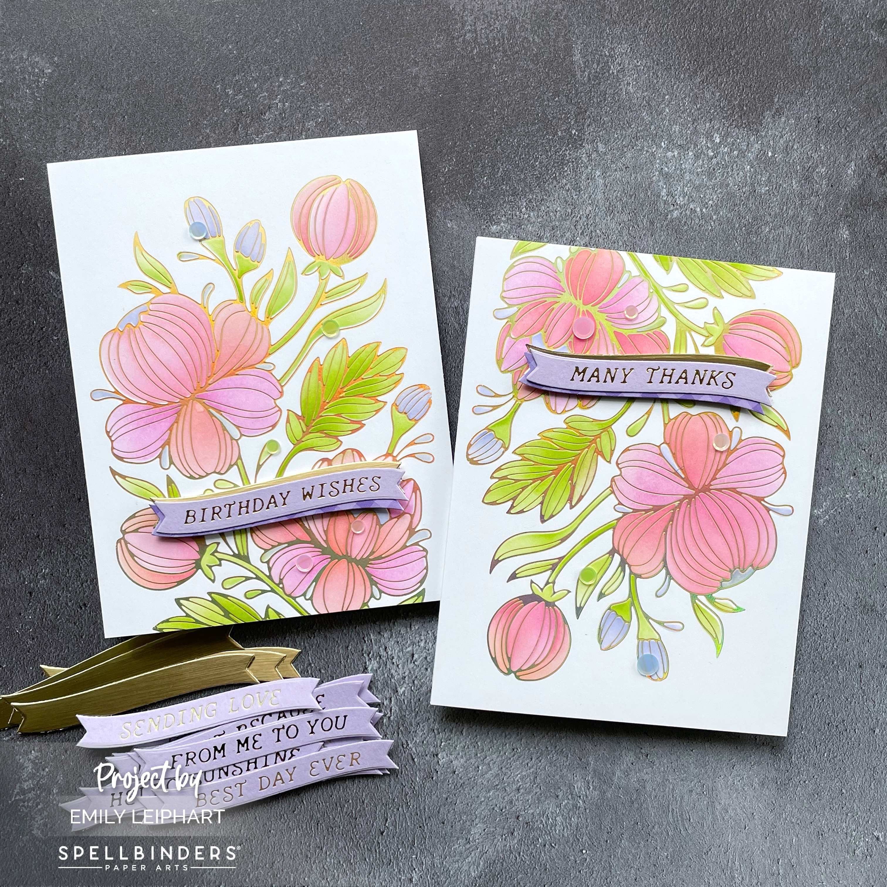
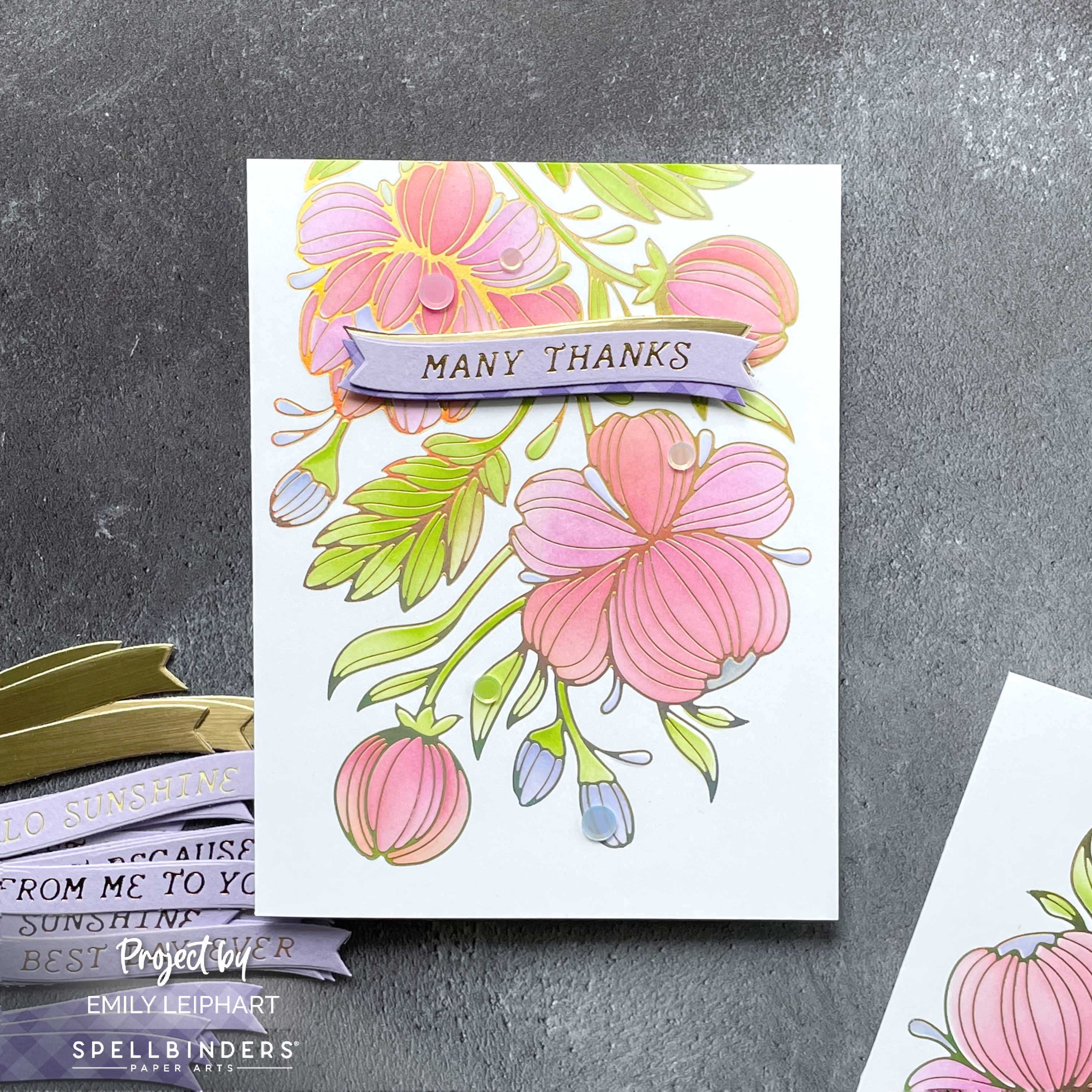
Hello again, crafty friends! You may recall my Glimmering Buttercups POST featuring the Glimmering Flowers Collection from Spellbinders. Today, I'm sharing two clean and simple, same-but-different cards I whipped up featuring the Glimmering Peonies Glimmer Plate and Stencil Bundle.


I needed a couple of quick cards and love having coordinating stencils to colour large, floral images such as this one. Even though I have quite a collection of birthday and thank you cards in my stash, none of them are ever quite right. Do you ever feel that way or is it just an excuse to make more cards? ;)


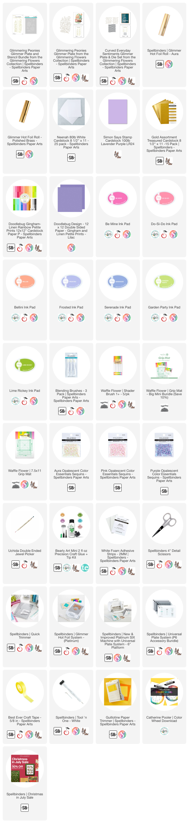
I started by heat foiling the Glimmering Peonies with Aura Hot Foil on Neenah 80lb White cardstock. Then I used Catherine Pooler's Color Wheel Download to select my colour palette and the ink colours I used are Be Mine, Do-Si-Do, Bellini, Frosted, Serenade, Garden Party and Lime Rickey.


If you don't have the coordinating stencils, you can colour these peonies with your favourite medium or simply heat foil them on dark cardstock and leave them uncoloured as I did in the past.


I loved mixing Be Mine with Do-Si-Do and Bellini on the larger flower petals. I love the way Frosted and Serenade work with the other colours. I went as light as possible with Garden Party and Lime Rickey, but I think I could've gone lighter or perhaps even left the foliage uncoloured for something different.


For the sentiments, I heat foiled the Curved Everyday Sentiments with Polished Brass Hot Foil on Simon Says Stamp Lavender cardstock. I actually tried two other foil colours before choosing this version.


I cut the sentiment banners again from both Brushed Metallic cardstock and Gingham Lilac patterned paper. These were layered behind both sentiments to complement the foiling and the bits of purple in the buds.


As you can see, the Glimmering Peonies Glimmer Plate is significantly bigger than an A2 panel so I decided to leave some of it off the bottom edge. You'll also notice that I flipped the thank you panel upside down for a bit of variation between the two cards.


I almost adhered the banners flat to the ink blended panel to make it super easy to mail but I decided to foam mount it for a tiny bit of dimension. I just couldn't resist! Again, I almost stopped there but I decided to use some flat sequins to add visual interest.


The sequins I used are from Studio Katia's Pastel Rainbow Confetti but you can find similar sequins in the Spellbinders store, available in Aura, Pink and Purple. Aura is a great colour that fills in the gaps nicely when you don't have matching sequins for every colour.


Do you like to make batches of cards using the same design and colour palette? I only thought to flip one of the panels at the last minute. Otherwise, I would've had both designs exactly the same but with different sentiments. What other ideas do you have for same-but-different card designs?


Please check out the NEW Christmas in July Sale, on now through July 28, 2024. You can save up to 50% select products. Prices are as marked. The sale also features discounts on select Clearance items. 


I appreciate you stopping by and, if you're inspired, please shop my affiliate links below. Spellbinders would love to know that you were inspired by me.

Thanks so much for your continued support!

Supplies:

Wednesday, May 1, 2024

Lunar New Year Challenge + Giveaways | May 2024


The Lunar New Year Challenge is back and since we've partnered up with your favourite craft companies all year long, that means there are giveaways every month! This month, we're giving away ONE $25 gift certificate to Simon Says Stamp, ONE $25 gift certificate to Lawn Fawn, ONE $25 gift certificate to My Favorite Things, and ONE $25 gift certificate to Catherine Pooler. That's a total of $100 in giveaways in May!


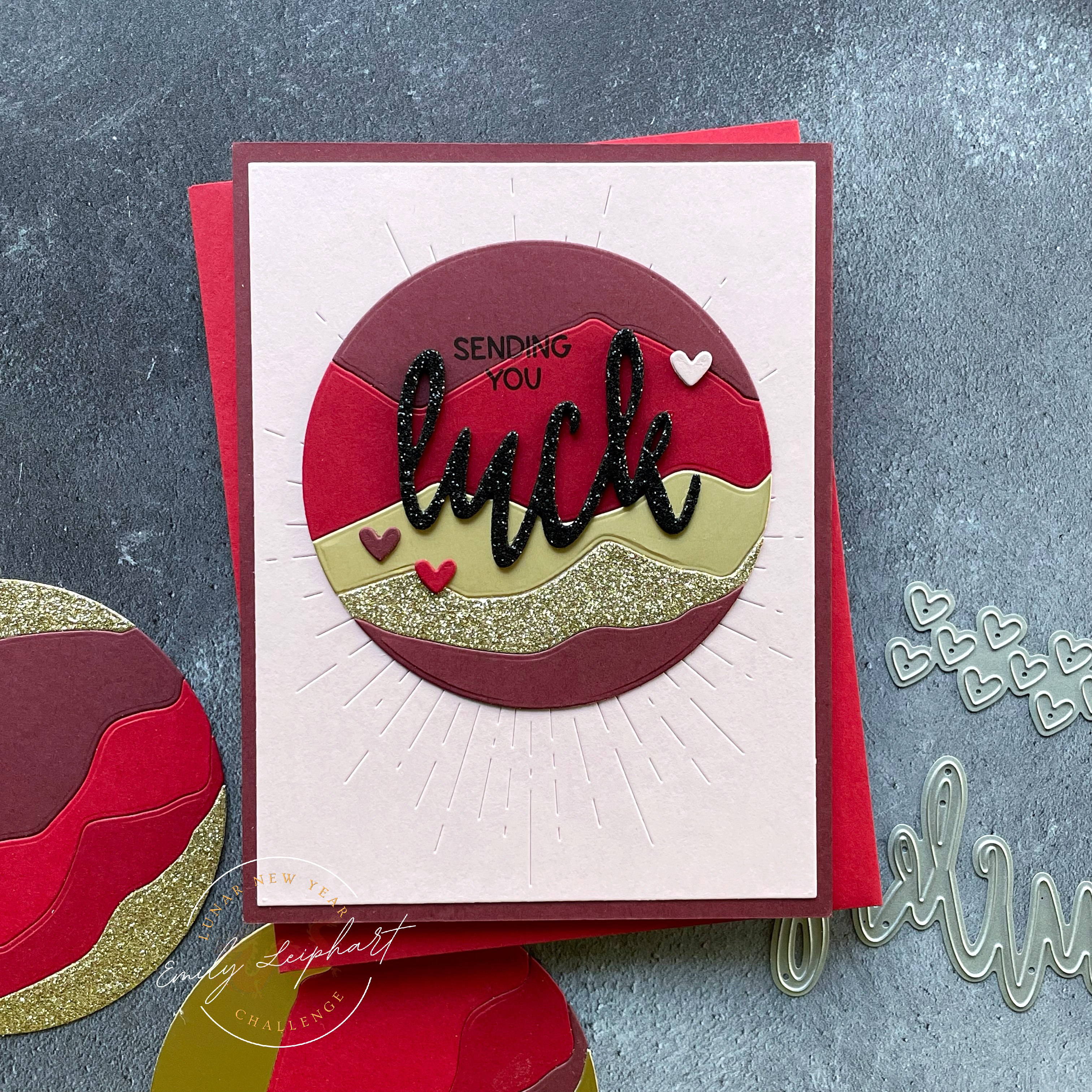
I haven't had a lot of time to craft these last few weeks but, luckily, I still had the leftovers from the February Challenge sitting in a pile on my desk. I had assembled several of Catherine Pooler's Circle Landscape dies using all the pieces I had die cut back then so this was relatively easy to throw together at the last minute.


The colours featured here are Cupcake, Cherry Pop, Mulled Wine, Matte Metallic Gold and Glitter Gold cardstock. The card base was cut from Mulled Wine to coordinate with the top and bottom pieces in the circle.


The Cupcake panel was cut with Taylored Expressions' Rays Pierce & Cut Plate. Before attaching the circle to the front panel, I die cut the Lucky Word Die from Black Glitter Foam and cut off the y. After gauging the position of the die cut word, I stamped two words from Lantern Festival to complete the sentiment.


I glued the Rays Pierce & Cut panel to the card base, then I attached the assembled Circle Landscape close to the top of the panel. After glueing the die cut Lucky Word to the circle, I die cut small hearts from the Hearts-n-Tags Dies in Cupcake, Cherry Pop, Mulled Wine. I stacked the hearts three high and glued them to the circle.


The rules are simple. You must create a new Lunar New Year, Chinese New Year or a 2024 Dragon Birthday card and add the link to your post in the link-up party. For the month of May, we are opening up the possibilities and invite you to make cards for Mother's Day, mother figures and other inspirational women in your life. If you're a Game of Thrones fan, think Mother of Dragons! Multiple entries are allowed. Backlinking to an older project is strictly prohibited.

Our May Lunar New Year Challenge will run from 12:00am EST on May 1, 2024 through 12:00pm EST on May 31, 2024. We would love to see you using products from our four generous sponsors! The four lucky winners will be randomly selected from all eligible entries and announced at the start of the June Challenge. 

(save and share with your project)

Visit the May Link-Up Party post HERE to see all of the design team projects and be inspired to create your own! When sharing your challenge entries on social media, feel free to save this badge and post it along with your project. Please tag us @lunarnewyearchallenge on Instagram and use the hashtag #lunarnewyearchallenge so everyone can find and be inspired by all your amazing projects.

Thanks so much for stopping by and I'll see you again soon!

Supplies:

Friday, March 15, 2024

Catherine Pooler | *NEW* Party Ink Release Follow-Up


I wanted to share one more card following Catherine Pooler's *NEW* Party Colors on Wednesday. If you missed the Sweetest Ink Hop, please head over to Instagram HERE. The deadline to comment for a chance to win a $100 gift certificate is 11:59pm EST on Monday, March 18, 2024! You can also click on the badge below and it will take you there, too.


Now that you've been fully introduced to Creamsicle, Lemon Sorbet and Frosted, which one is your favourite? I've been addicted to peachy shades lately and I absolutely love orange as a colour so I would have to say Creamsicle but Frosted definitely runs a close second!


For today's card, I really wanted to use the Creamsicle Gingham from the Spring Gingham Patterned Paper. It's my favourite out of the entire paper pack. The ink colours I chose for the Daffodil Blooms are older colours that came together by accident but shows you how amazing the new colours mix with others.


I'm absolutely in love with this colour palette of Creamsicle, On the Lake, Lilac and Royal Treatment! As before, I also added a tiny bit of Lemon Sorbet to the stamped bee. This design is really giving me birthday vibes so I would love to stamp more of these daffodils, switch out the sentiment, and make some birthday cards.


To create the opening for the daffodils, I used the largest of the Nested Oval Dies and stamped the sentiment in two colours before popping up the frame with foam strips and attaching the daffodils and stems. To embellish the card, I used seed beads from the Salt Lake City Sequin Mix to create stamen for the daffodils.


If you missed my other posts featuring Catherine Pooler's *NEW* Party Colors, you can find them here:


I appreciate you stopping by and, if you're inspired, I hope you'll shop my affiliate links below. Catherine Pooler would love to know that you were inspired by me. Thank you for your continued support! :)

Supplies: 

Wednesday, March 13, 2024

Catherine Pooler | Sweetest Ink Hop + Giveaway


It's Release Day at Catherine Pooler and the *NEW* Party Inks and Spring Gingham Patterned Paper are now available for purchase! We're also having an Instagram Hop to celebrate and you could win a $100 gift certificate just for hopping along. While appreciated, comments here on the blog will not count. 


Be sure to head over to Instagram HERE and enjoy all of the amazing inspiration by Catherine Pooler's design ambassadors and special guests! You have until 11:59pm EST on Monday, March 18, 2024 to enter and the winner will be announced on Tuesday, March 19, 2024.


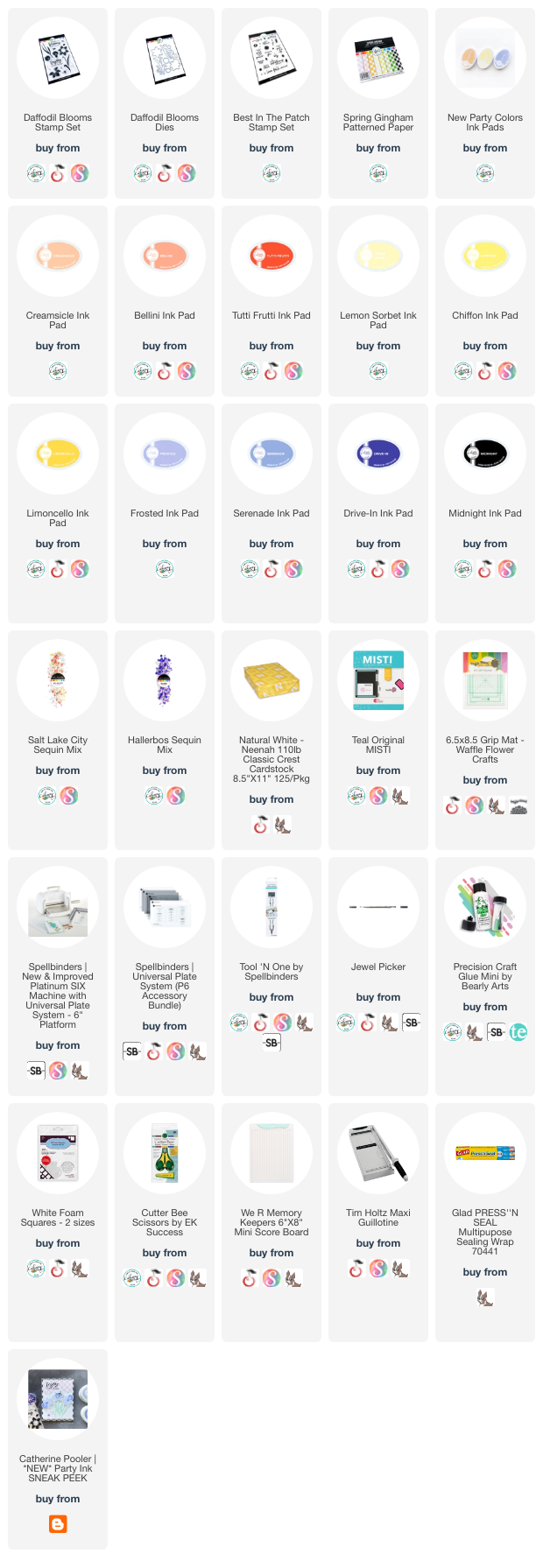
As with my Sneak Peek post HERE, I'm featuring the Daffodil Blooms stamp set and coordinating Daffodil Blooms Dies once again for this duo. It's such a gorgeous and versatile set, perfect for spring cards and more!


I started by selecting the ombre trios for these daffodils. Since there are two styles of daffodils in this set, I wanted to stamp them with all three shades in each trio. For the new Lemon Sorbet ink, I paired it with Chiffon and Limoncello. For the new Creamsicle ink, I paired it with Bellini and Tutti Frutti. For the new Frosted ink, I paired it with Serenade and Drive-In.


I stamped two daffodils in each pairing for each card and since I wanted a bit of variation between the two cards, I stamped a third daffodil with Creamsicle and Tutti Frutti flower for the first card and a third daffodil with Frosted and Drive-In for the second card.


For both cards, I cut the base from Neenah white linen cardstock and cut a 1.25x5.5" strip of Garden Party Gingham from the Spring Gingham Patterned Paper and adhered it to the card base.


After arranging the flowers down the left side over the gingham strip, I used Glad Press'n Seal to pick up the arrangement and preserve the position of the flowers as is. I added foam squares to the back of three of the daffodils and added glue to the back of all the others.


When I pressed the sheet of daffodils back down on the cards, they were perfectly arranged as before. I trimmed off the overhanging pieces on the bottom of the cards. When I mail them, I may trim off the excess at the top and left side of the card but for now, I'm leaving them as they are.


Next, I placed the cards in my Teal MISTI stamping tool and stamped sentiments from the Best in the Patch stamp set that best fit the space between the daffodils. 


To embellish the cards, I used a mix of sequins from both the Salt Lake City and Hallerbos Sequin Mix.


I love the way these turned out and I love the variation between the different shades of daffodils. Popping up just a few of the daffodils on each card gives them enough dimension for visual interest and I love the way the Garden Party Gingham replaces the foliage for the daffodils.


I appreciate you stopping by and, if you're inspired, I hope you'll shop my affiliate links below. Catherine Pooler would love to know that you were inspired by me. Thank you for your continued support! :)

Sources: