
I'm thrilled to be part of the Spellbinders January 2021 Clubs Inspiration Blog Hop! You should've arrived from Virginia Lu's blog and I have the full list of participants below. There are also details on the generous giveaway so be sure to read 'til the end. For this hop, I created two cards with contrasting colour themes - dark and light - using both the Small Die of the Month and the Clear Stamp of the Month. Be sure to let me know which one you like better!

I used the same colours on both cards but in different proportions. I started by using all four dies from the Small Die of the Month. Originally, I only planned to make one card for this hop but the die cutting became addictive, as it did with my last two posts featuring the Spellbinders Club Kits.

The card base for the darker card features sea salt cardstock and I used that for the inside rectangle of the lighter card. I love this shade of grey because it's just dark enough to provide a slight contrast against the white linen cardstock.

The largest die in the Small Die of the Month leaves a solid centre but there was too much red so I used the inner rectangle to cut out that section to allow the sea salt card base to show through. Both of the inner rectangle pieces were layered over a second piece die cut from heavyweight cardstock for added dimension.


I used the basic sentiment from the Clear Stamp of the Month and heat embossed them with white powder on oreo cardstock, and in silver powder on white linen cardstock. I trimmed them to fit the width of the inner rectangle and attached them to the card with scor-tape.


HOP ALONG!
Spellbinders Blog
Tina Smith
Becky Roberts
Desiree Kuemmerle
Carrie Rhoades
Bibi Cameron
Laurie Willison
Jill Hilliard
Marie Heiderscheit
Jennifer Snyder
Jean Manis
Henriëtte van Mierlo
Annie Williams
Yasmin Diaz
Brenda Noelke
Betty Wright
Melody Rupple
Jenny Colacicco
Dilay Nacar
Hussena Calcuttawala
Mindy Eggen
Virginia Lu
Emily Leiphart
GIVEAWAY
To celebrate this release, we are giving away a $50 gift certificate to 3 lucky blog readers – selected from the comments on our blog. Giveaway closes on Sunday, January 17th, 11:59 pm MST. The winner will be announced in this blog hop post the following Tuesday. The winner is responsible for shipping cost, duties and taxes.
Please note, store credit (gift certificate) cannot be applied to Club Subscriptions. Store credit can be applied to shop past Club products, Club extras and regular releases.
I'm the last stop on today's hop so I will direct you back to the Spellbinders Blog to begin the hop. Thanks so much for hopping along with us!
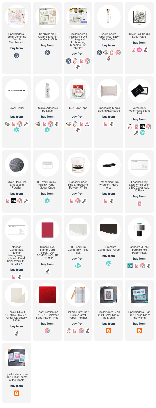
Supplies:


36 comments:
I love them both, Emily! Guess I'd say the light colored one is my favorite, but hard to choose! Thank you for the ispiration I need to use my Small Die Kit when it arrives!
Gorgeous cards, I love the dark one for a masculine card and the light card for a gal pal.
I like them both. Thanks for the ideas.
Beautiful! I love the black, and I would Never have thought of using it for Valentines day! So elegant. Thanks for sharing
These are both soooo elegant and gorgeous!
Great use of contrasting colors
Beautiful work! Thank you for the inspiration!
Both cards are lovely. I think the darker one is perfect for giving to a male and the lighter one for a female. Love your choice of colors. Thanks for sharing your wonderful talent and inspiration with us. :)
Well, if you insist... of course I like the card with more red! ;) But both are beautiful cards in these traditional Valentine colours. <3
Your cards are very elegant...they inspire me to buy some red paper and get creavtive! Thank you.
Both cards look
amazing and great
color choices.
Carla from Utah
I like both color combos. The soft colors, and the highly contrasting ones. The dies are amazing!!! sharon dot gullikson at gmail dot com
Very striking cards. The dark color combo lends itself to a masculine valentine, which I need, but I like both.
Love the black contrast!
Both of your cards are gorgeous! Like a couple of other commenters, I'd use the red/black for sending to a guy and the white card looks more feminine. I love them both. Thank you for bringing these die sets to life. Very nice.
Very elegant!
Very nice!
Simply wonderful cards with these great dies.
I love your style and both cards are stunning!
such beautiful cards
stunning cads - very elegant
Loving the striking, bold colors and elegant designs!
Beautiful designs and color combos! I love the light one... so elegant looking!
Love the colors, they kinds remindsme if a deck of fancy cards. These are fun and beautiful. The contrast is exceptional! Love these!
Love, Love the colors
Gorgeous cards!
Saved the best for last! These are my favorite cards on the blog hop. Lovely color choices!
Love both cards but the red and black really stood out to me. It makes it look so rich. Thank you for sharing!
Love the masculine and feminine looking cards. Beautiful!
FABULOUS CARDS! Thanks for sharing your inspiration.
Loved your card idea.
Love the light one but the dark one is so incredibly gorgeous as well!! Great job and inspiration with the small kit!! Smart how you used the die cuts to make two cards from the same cuts!
Very beautiful work! Thanks for the fabulous inspiration!
Can't help but fall in love with both cards, but I think the red framed one is most dramatic. You are a very meticulous, exacting, and patient card designer. Mahalo for the inspiration.
So elegant and I like the colors.
Lovely cards! Thank you for sharing!
Post a Comment