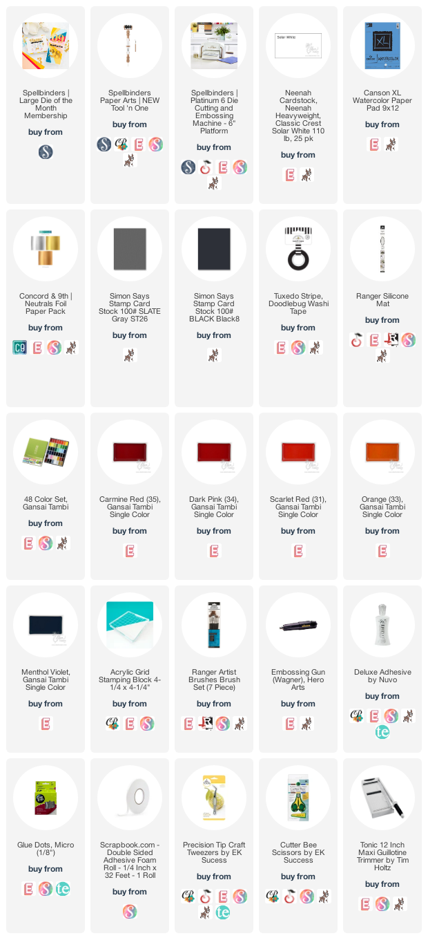
The colours are so incredibly solid and vibrant. They're also sold individually, if you prefer a smaller investment. From the top, I used Carmine Red (35), Dark Pink (34), Scarlet Red (31) and Orange (33). I dried each colour with my heat tool before adding the next with a wide brush. Then I used Menthol Violet (66), Gold (90) and White (10) to create splatter on the background.
When the panel was completely dry, I trimmed it down to 4" x 5" so I could added a strip of washi tape at the top of the card for contrast. All of the 'Happy' letters, except the 'a' were popped up with foam tape. I did this for visual interest and so it would match the 'th', which I adhered flat with liquid glue. I cut out the '12' four times, once in gold foil and again in white, grey and black cardstock. I offset the white and black layers to create light and dark shadows.
You can subscribe any time during the month of February to receive these specific products:
Supplies:


2 comments:
I love the vibrant colours! They pair with the gold so well. Love the fonts of the numbers and letters, too.
so pretty!!
Post a Comment